Nano Banana Pro: AI Infographic Generator for Flowcharts & Step-by-Step Diagrams

Have you noticed that more and more people prefer using infographics to explain things? Whether it's “how to change a light bulb,” “safety rules for kids,” “product usage steps,” or workplace flowcharts, team SOPs, and information charts —as long as the content can be turned into a single visual, comprehension speed increases dramatically.
The reason is simple: We receive overwhelming amounts of information every day, yet our attention span keeps shrinking. Compared with long paragraphs of text, most people prefer visuals that have clear structure, logical visualization, and friendly color design. Images are easier to absorb, easier to share, and easier to save or use in work and social media.
But the real headache is the process of actually “making the infographic.” You need to think about the order of steps, decide where each box should go, pick the color palette, choose icons, adjust alignment, and even switch back and forth between Figma / PPT / Canva to fix the layout repeatedly.
Creating a simple tutorial graphic may take 20–40 minutes, and making a flowchart often leads to messy logic and messy layout—the more you revise it, the worse it gets.
That’s why users have recently been paying extra attention to one question— Is there a tool that can automatically turn complex information into a clear and beautiful visual?
And now, the newly launched Nano Banana Pro solves exactly this problem. Based on the text you provide, it can automatically generate well-structured, professionally designed visual diagrams:
- Clear and easy-to-understand step-by-step infographics
- Professional-level flowcharts
- Neatly organized information charts
- Visual tutorial graphics, comparison charts, concept diagrams, and knowledge summary visuals
You only need to provide the information, and Nano Banana Pro automatically completes the process: breaking down logic → building structure → generating icons → arranging the layout → beautifying the final visual.
The result is simple: Content that used to take half an hour to create can now become a ready-to-use chart with just one sentence and one second. It’s not only faster but also more professional, making your instructions, tutorials, workflows, and product content much easier to understand and remember.
In a time when visual communication is gradually becoming the “default way to communicate,” the ability to quickly generate clear and easy-to-understand charts is no longer just a designer’s skill—it has become an everyday tool that everyone needs. And AI diagram generation is making this easier than ever before.
Why have infographics become so important?
The reason infographics suddenly became a content format used across all platforms and by all types of users is simple: modern people are facing an ever-growing amount of information, while the time and mental energy they are willing to spend on reading and understanding continue to decrease. Everyone wants to absorb as much information as possible in the shortest amount of time. And because infographics use visual structure, color blocks, icons, and short sentences, the brain can absorb the content almost effortlessly—making them the most efficient form of communication today.
The value of infographics lies first in their ability to make complex information easy to understand. Processes, steps, comparisons, rules, paths, data—content that originally required long paragraphs of explanation—becomes extremely clear once divided into color-coded sections, connected by arrows, organized by numbered steps, and supported by icons. Users don’t need to reason, nor read from start to finish; they can understand the whole picture simply by following the visual structure. This “visual guiding ability” makes infographics far lighter and more intuitive than plain text.
Second, infographics are highly effective for teaching others. Whether it’s teachers explaining lessons, parents educating children, sellers creating installation instructions, companies doing workflow training, or content creators explaining concepts, a single image is often more effective than ten sentences. Infographics reduce misunderstandings, lower communication difficulty, and speed up knowledge transfer—making them the preferred format for instructional and explanatory content.
Social media is also a major factor behind the rapid rise of infographics. On mobile screens, people’s attention span is extremely short, and platform algorithms prefer visual, easy-to-read, and easy-to-save content. Infographics—with clear colors, tight structure, and the ability to be read within one screen—are perfect for platforms like Xiaohongshu, Instagram, Pinterest, and Weibo. They naturally carry a high level of “shareability,” so creators who care about reach and performance are more inclined to use them.
Another important advantage of infographics is that they allow people without design skills to create professional-looking content. Because infographics have inherently clear structure and fixed layout patterns, users simply need to fill in the content to produce visuals that look clean and easy to understand. This lowers the design barrier, encouraging more everyday users to adopt visual expression instead of relying on complex tools or professional designers.
In addition, infographics serve as a highly efficient information compression method. Content that originally required multiple paragraphs of text, several illustrations, flow explanations, and long lists can now be condensed into a single visual. This not only saves reading time but also enhances professionalism, making the content easier to archive, share, save, and present.
Lastly, infographics significantly improve communication efficiency. In team collaboration, a clear flowchart reduces errors; in teaching, a knowledge-structure diagram speeds up comprehension; in e-commerce, a step-by-step diagram reduces after-sales issues. Infographics minimize repeated explanations and increase communication accuracy, making them the most straightforward tool for boosting efficiency.

The 10 Most Common Types of Infographics Users Create
In everyday use—whether you are doing e-commerce, education, content creation, product instructions, or tutorial teaching—infographics are the most effective visual format for helping users quickly understand information.
To help you easily find the infographic type that suits your needs, here is a list of the 10 most commonly created infographic formats Each one includes “What it is + Main purpose + Typical use cases,” so you can understand everything at a glance in one chart.
| Infographic Type | What It Is | Main Purpose | Common Use Cases |
|---|---|---|---|
| Step-by-step Infographic | A visual graphic that explains “how to do something” in clear, sequential steps | Helping users quickly understand an operation or process | Product installation tutorials, cooking steps, safety tips, children’s educational visuals |
| Flowchart | A diagram using nodes and arrows to show processes, logic, and decision paths | Visualizing process structure and organizing complex logic | User registration flows, business processes, customer service SOPs, product logic diagrams |
| Timeline Infographic | A chronological visualization showing how events develop over time | Presenting history, long-term plans, and project milestones | Brand history, product iterations, annual plans, project schedules |
| Comparison Infographic | A visual comparison of two or more items | Helping users evaluate options and highlight differences | Product A vs. B, pricing plan comparison, version differences, solution selection |
| Info Sheet / Cheat Sheet | A structured chart that organizes key concepts, rules, or knowledge points | Quick reference, knowledge summary, concept clarification | Study notes, rule explanations, tutorial summaries, exam cheat sheets |
| Data Visualization / Statistical Infographic | Data presented using bar charts, pie charts, line charts, or statistical visuals | Showing data trends and analysis more intuitively | Marketing analytics, industry trends, quarterly reports, user data displays |
| Safety Instruction Infographic | A visual format presenting precautions and operating steps | Ensuring safe and accurate user operation | Appliance instructions, child safety guidelines, product warnings |
| Workflow Infographic | A diagram showing task and process relationships within a team or project | Clarifying collaboration and improving team efficiency | Project management flows, team collaboration maps, cross-department workflows |
| Mind Map Infographic | A structured diagram breaking down a topic into branching concepts | Organizing thoughts and building knowledge structures | Study notes, article outlines, brainstorming, class summaries |
| User Journey Map | A visual map showing the entire experience from first touchpoint to goal completion | Analyzing user behavior and optimizing experience | UX design, product experience analysis, marketing funnel visualization |
The Real Pain Points Users Face When Creating Infographics
Creating infographics, information charts, and flowcharts is not simply a matter of “drawing a few lines and placing a few icons.” In actual practice, most users face multiple pressures at the same time—such as difficulty organizing content, easily confused structure, unprofessional visuals, and low production efficiency. Below are the real pain points that users commonly experience across different scenarios.
1.Clear logic in the mind, but unable to “express it in a structured way”
Most users already understand the process and key points in their minds, but when they actually try to turn the content into an infographic, they often don’t know where to start: Should they use a step-by-step infographic, a flowchart, or a tree structure? Which parts are the main points and which are supporting details? Once the information increases even slightly, the layout becomes messy, the logic becomes unclear, and users run into the common problem of “I clearly understand the content, but I can’t draw it.” Common issues include:
- Unsure whether to use a step-by-step infographic, a flowchart, or a multi-column layout
- Difficulty converting mental logic into nodes, arrows, and hierarchy
- When information exceeds 4–5 items, the visual becomes cluttered and the main storyline becomes unclear
- Unable to judge what needs emphasis and what should be simplified or merged At the core, the challenge is not that users cannot use the tools—it's that they lack the ability to transform content into structured and visualized expression.
2.Layout is time-consuming and requires endless detailed adjustments
When creating an infographic in PowerPoint, Figma, or Canva, the biggest time cost for users often doesn’t come from the content itself—it comes from dealing with countless tiny layout details: alignment, spacing, node size, arrow direction, icon style… Any slight inconsistency can make the visual look unprofessional. The most frustrating part is that once you edit a single line of text or add one extra step, the entire layout may shift or collapse, forcing users to realign and rearrange everything again. Even a simple infographic can take 30 minutes or more to complete.
Common layout frustrations include:
- Constantly adjusting node positions and sizes to keep them aligned
- Frequently tweaking arrow direction, curvature, or length
- Icons often having inconsistent sizes, stroke thickness, or visual style
- A single text edit causing the entire layout to deform
- Difficulty controlling whitespace or line spacing, resulting in an unbalanced composition
These actions contribute almost no actual content value, yet they take up more than 70% of the production time, leaving users feeling like they are “not creating an infographic, but being tortured by layout work.”
3.Inconsistent icon styles lead to unprofessional visuals
Users often download icons from various sources or mix elements from different templates, which results in inconsistent line thickness, mismatched colors, and a mix of flat and skeuomorphic styles. Even if the content is correct, the final infographic still gives off a strong “patchwork” feeling, making it look unprofessional and unsuitable for formal use or external company communication.
4.Too much text and poor content refinement lead to low infographic readability
When creating infographics, the most common problem users face is not “insufficient content,” but rather “too much content with little refinement.” Many people directly stuff entire paragraphs into each section, resulting in dense visuals, unclear emphasis, and heavy cognitive load—ultimately losing the very purpose of infographics, which is to “simplify complex information.” What infographics really require is hierarchical expression, not text dumping.
However, users often don’t know how to transform long-form text into a clear structure, leading to the following difficulties:
- Unclear which information is the main storyline and which can be omitted
- Unable to break text into “title → subtitle → steps → key points”
- Unsure which information could be replaced by icons or visual symbols instead of words
- Sections end up filled with text, resulting in a poor reading experience When users lack content extraction and refinement skills, an infographic becomes nothing more than a “condensed block of text”—neither visually appealing nor easy to understand, directly harming readability and communication effectiveness.
5.Updating content requires full re-layout, resulting in extremely high iteration cost
In real work scenarios, infographics are rarely “finalized in one draft.” It’s very common to adjust a process, add a new step, or revise a few lines of text. However, in traditional tools, once the content changes, the layout easily collapses: users must re-number items, re-divide sections, adjust arrows, and fix alignment—meaning every revision feels like “rebuilding the entire graphic.” The iteration burden becomes extremely heavy. Typical situations include:
- After adding one new step, all previous and subsequent steps must be re-numbered and re-aligned
- When a sentence becomes longer, the original block no longer fits and the entire section must be rearranged
- Deleting a node requires redrawing related arrows and connecting lines
- When the process logic changes, the entire layout practically needs to be redesigned from scratch
The result is that a second revision often feels more painful than creating the infographic the first time, making many users instinctively avoid updating their diagrams altogether.
6.Different platforms require different dimensions, forcing users to create multiple versions
Instagram requires vertical images, X needs horizontal images, Pinterest prefers long graphics, and websites need large banners. Users often have to prepare four different file sizes, and each one requires a new layout and visual balance adjustment. Even when using the exact same content, a large amount of repetitive work is needed, causing the production cost to multiply.
7.Aesthetic uncertainty makes it hard to judge visual quality
For many users, the biggest confusion when creating infographics is not the content, but the visual aesthetics. Lacking design experience makes it difficult for them to evaluate whether the colors, fonts, line spacing, alignment, or layout are visually harmonious. The infographic may be “usable,” but it often lacks a professional look—affecting communication effectiveness and lowering the perceived quality of the brand or educational material. Common design judgment challenges include:
- Are the color combinations too many or too chaotic?
- How should font size, weight, and hierarchy be differentiated?
- How much line spacing and whitespace is needed to avoid a crowded appearance? Because these basic visual judgments are missing, many infographics end up looking noticeably “amateur,” making it difficult to achieve the quality required for professional scenarios.
8.Insufficient aesthetic foundation and uncertainty about “what actually looks good”
Many users lack visual design experience, and they don’t know how to choose colors, line spacing, alignment methods, or layout direction. They also don’t understand color theory or visual hierarchy. As a result, the infographics they create are often “not ugly, but not refined,” making them fall short of the communication quality expected from professional diagrams and weakening the overall brand or classroom image.
The biggest pain point for users is not “not knowing how to use the tools,” but the fact that effective infographic creation requires both structural logic and visual design skills—and most people lack both. Traditional tools also consume a large amount of time on layout details, making the process of creating infographics a highly painful workflow.
Why AI infographic tools are becoming so popular
AI infographic tools (AI infographic generator, AI flowchart maker, AI diagram tool) have continued to surge in popularity during 2024–2025. The reason is not a single trend, but the combined effect of soaring content demand + lower design barriers + rapid growth across multiple industries. In an era where content production is accelerating, users need to present complex information in a way that is faster, clearer, and more shareable. Whether you are a teacher, parent, marketing writer, e-commerce seller, operations manager, HR, PM, or even a regular student, you deal with content every day that requires visual communication: step-by-step instructions, process breakdowns, tutorial infographics, operation guides, comparison charts, teaching diagrams, product installation visuals, and more. Infographics have become the most intuitive, most readable, and most suitable format for social-media-friendly content.
The rise of AI tools fundamentally comes from their ability to eliminate the long-standing pain points of creating infographics. Traditional methods, while professional, require design skills, layout knowledge, aesthetic training, plus the work of finding icons, planning structure, and choosing color schemes. Now, with AI, you only need to input text or key points—the system automatically handles visual layout and structural design, enabling anyone to create professional-level infographics, flowcharts, or information charts within seconds.
To make these reasons clearer, here is a concise breakdown (kept tight, without expanding the layout):
- Content explosion: Course notes, workplace SOPs, product step diagrams, and social media tutorials all need fast visualization.
- High design barrier: Layout, composition, and color matching are difficult for most people, and AI solves the pain point of “I can’t design.”
- Rapid growth across industries: Education, e-commerce, SaaS, corporate training, operations, and blog SEO are all adopting infographics at scale.
- Extremely fast generation: AI can turn text into full infographics, flowcharts, comparison charts, and step-by-step diagrams—saving massive time.
- Scalable output: One set of content can be quickly rendered in multiple styles, sizes, and languages for social media, classrooms, and websites.
More importantly, the popularity of AI infographic tools is not just because they are “cheap and fast,” but because they transform work that once required a designer into something anyone can do. For example: Teachers can create teaching flowcharts in just a few minutes; HR teams can quickly produce onboarding guides; parents can easily make safety instructions; PMs can generate product workflows; marketing writers can create social media infographics; sellers can produce installation step diagrams; content creators can make “one-page tutorial infographics”; and even SaaS websites can automatically generate user operation flowcharts. These high-frequency, practical, cross-industry scenarios have made the AI infographic generator one of the fastest-growing content tools in the past year. It’s not just a trend—it's becoming the mainstream way to present information in the future.
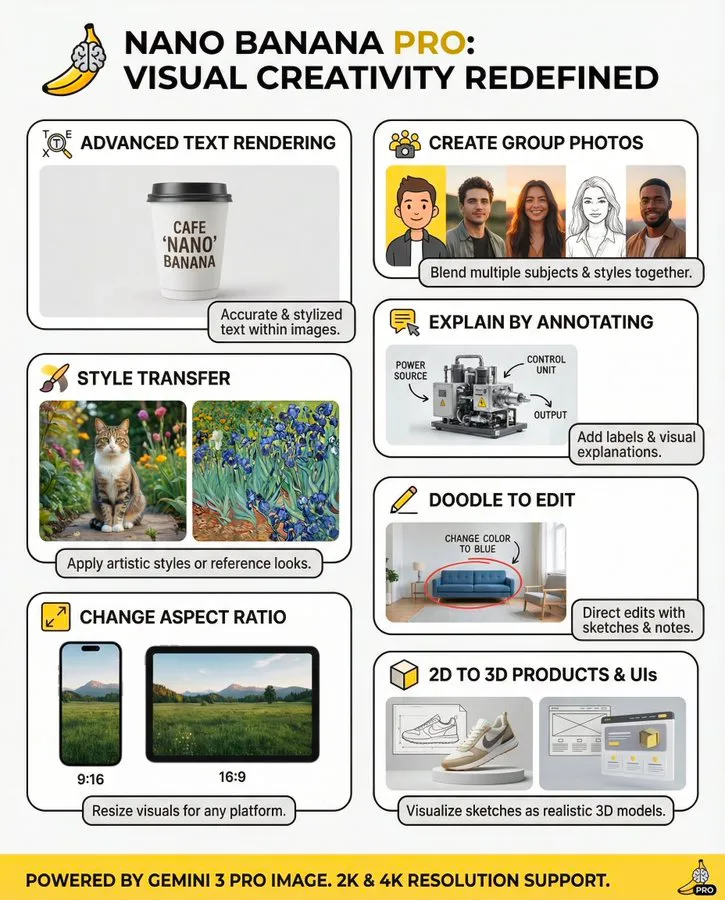
What can Nano Banana Pro help users do?
As a professional-grade AI infographic generator, Nano Banana Pro is not just a tool that “creates visuals.” It helps users automatically organize scattered information into well-structured, professionally colored, easy-to-read, and easy-to-share infographics, flowcharts, and information charts. Whether you’re using the content in a PPT deck, classroom materials, social media posts, blog articles, or internal training documents, it can generate high-quality diagrams in just a few seconds.
The core value of Nano Banana Pro can be summarized in three points: (1) Automatically understands content structure: You only need to input text, steps, key points, or a short explanation. The AI will automatically identify the hierarchy and generate the appropriate chart type (flowchart, step-by-step infographic, comparison diagram, reminder-style infographic, etc.).
(2) Automatically completes design and layout: The AI generates professional color schemes, clean layouts, consistent icons, and clear visual hierarchy with one click—allowing people with zero design skills to create infographics that “look like they were made by a designer.”
(3) Reusable across multiple scenarios: A single set of content can be quickly converted into multiple forms of visual charts, such as teaching infographics, product guides, process step diagrams, operation SOPs, and social media share graphics—making the same content easy to display across different platforms. Simply put, it transforms “creating an infographic” from a professional design task into a smooth experience of “input text → auto-generate.”
To see the practical value of Nano Banana Pro more clearly, you can refer to the following real-world usage scenarios:
1.Parents creating a children’s safety guideline infographic
Parents only need to input a few safety key points, such as “how to choose a safe route after school,” “what to do when encountering strangers,” “emergency phone numbers,” or “warnings about common household hazards.” Nano Banana Pro will automatically identify the nature of the content and select a structured infographic style suitable for children to read. The AI generates a soft-colored, clear-icon, well-segmented Safety Infographic, allowing kids to understand the information at a glance and remember emergency instructions more effectively. This scenario is characterized by strong readability and clear visual guidance, making it ideal for printing and posting on desks, entryways, or school bulletin boards.
2.Teachers generating classroom teaching step diagrams and teaching flowcharts
Teachers can input the course structure, experiment steps, classroom flow, key board-writing points, or knowledge breakdown notes in text form, and Nano Banana Pro will automatically convert them into a teaching flowchart, a knowledge structure diagram, or a step-by-step teaching infographic. The AI selects the most appropriate layout based on the teaching scenario—for example: step-by-step diagrams emphasize “sequence,” while structure diagrams emphasize “knowledge hierarchy and logical relationships.” This allows teachers to communicate content more effectively in class presentations, PPT slides, blackboard displays, and online lessons, improving student comprehension and classroom engagement.

3.HR creating onboarding flowcharts and new-hire guidance information charts
HR only needs to provide the key nodes of the onboarding process, such as document submission, company introduction, policy training, tool activation, and probation-period goals. Nano Banana Pro can automatically generate a well-structured Onboarding Flowchart / Information Chart. The output includes step numbering, corresponding explanations, required materials, and cross-department processes, enabling new employees to quickly understand the workflow on their first day and reducing communication costs. This type of infographic is especially suitable for publishing on the company internal wiki, Notion pages, Slack channels, or printed inside a welcome kit.
4.Product managers creating product flowcharts and user journey diagrams
Product managers can directly paste requirement document sections, user task flows, or key feature points into the tool, and the AI will automatically identify the logical relationships and generate a professional Product Flowchart, User Journey Diagram, or Feature Map. This greatly improves cross-team communication efficiency: developers can understand requirements faster, designers can adjust interactions based on structure, and operations teams can clearly grasp the product logic. For SaaS products, apps, and tool-based platforms, this capability is a high-frequency essential need.
5.Marketing writers creating social media infographics and content breakdown visuals
Marketing teams often need to turn long-form content into “one-glance summaries” suitable for Instagram, Facebook, X, and Pinterest. After entering the key text points into Nano Banana Pro, the AI automatically generates visually clear and stylistically consistent Social Media Infographics, such as tutorial breakdowns, TOP 10 lists, trend analysis visuals, step-by-step guides, comparison charts, and data highlight graphics. Without using any design software, marketers can produce professional-level visuals that significantly improve content save rate, share rate, and overall reach.
6.E-commerce sellers creating product installation step diagrams and operation instruction charts
Sellers only need to provide product functions, installation steps, and important precautions. The AI will automatically generate a clearly structured Step-by-Step Installation Chart or Operation Instruction Information Chart. Examples include furniture assembly guides, electronic device usage manuals, skincare application steps, and kitchen tool installation processes.
Visualized steps significantly reduce after-sales inquiries, increase buyer trust, and can be directly used in product detail pages, FAQs, or printed insert cards inside the package.
7.Content creators generating “one-graphic tutorials” and knowledge explanation visuals
Content creators often need to break down knowledge, skills, or processes into tutorial infographics that users can understand instantly. Whether it’s software tutorials, AI prompt engineering tips, daily skill lessons, fitness step instructions, or workflow optimization, Nano Banana Pro automatically selects the most suitable structural template—such as a 3-step diagram, 4-quadrant chart, tips checklist chart, or process pathway graphic.
This type of content is ideal for blogs, YouTube thumbnails, Pinterest, Knowledge Planet communities, Xiaohongshu, and other platforms.
8.SaaS websites generating user operation flowcharts and feature guidance diagrams
SaaS websites often need to visualize “how to use a feature” or “how to complete a key task” so users can understand the product more quickly.
By simply entering the feature description, step order, interface logic, and operation goals, Nano Banana Pro automatically generates User Onboarding Diagrams, Feature Flowcharts, and Information Charts suitable for product documentation, help centers, release notes, and onboarding guides. These visuals effectively reduce user churn and lower the learning cost of getting started with the product.
In summary, Nano Banana Pro is not a traditional drawing tool—it is a true AI infographic solution that can “accelerate content production, improve information delivery efficiency, and reduce design costs.” For education, e-commerce, SaaS, workplace communication, classroom teaching, and content creators, it can significantly shorten creation time, make content more professional, easier to understand, and more shareable.
Summary: Infographics are becoming the next-generation communication method, and AI is making it easier than ever
As content production continues to scale and reading becomes increasingly fragmented, infographics, flowcharts, and information charts are no longer skills exclusive to designers—they have become high-frequency tools needed by teachers, parents, sellers, professionals, and creators. Clear structure, visualized logic, easy sharing, and easy comprehension have made infographics gradually evolve into a form of “default communication language.”
In the past, creating infographics was time-consuming and required design knowledge: understanding logical structure, mastering layout, coordinating colors, and manually adjusting every node, arrow, spacing, and icon. As content updated and steps changed, people had to repeatedly redo the entire diagram, making many users shy away from “making visuals.” But now, AI is rewriting this workflow.
AI infographic generators like Nano Banana Pro do more than simply turn text into visuals—they automatically understand your content structure, automatically choose the appropriate visual format, and automatically create professional layouts, allowing anyone to generate high-quality infographics, flowcharts, and step-by-step diagrams within seconds.
Faster, easier, more professional, and more aligned with how users prefer to consume information today. If you’re creating tutorials, classroom content, e-commerce instructions, SaaS user onboarding guides, product workflows, social media visual breakdowns, or simply want to turn complex topics into “one-graphic tutorials,” then an AI infographic tool will become the most powerful efficiency engine in your daily work.
Want to generate professional infographics faster?
If you also want to turn text into clear, professional, and shareable visuals in seconds, you can try our AI chart tool (supporting infographic, flowchart, step-by-step graphic, information chart, and more). Whether you're working in education, e-commerce, SaaS, content creation, or product design, you can generate structured visual charts simply by entering your information.
👉 Try AI chart generation now and make your information more efficient to present:
(We continuously update more AI visual tools, including AI image generation, AI chart generation, AI flowchart generation, and more—making your content creation easier than ever.)