How to Make AI Product Photos Look Real: A 5-Minute Check
Fix fake-looking AI product photos by checking product accuracy, lighting, shadows, reflections, materials, scale, and perspective.

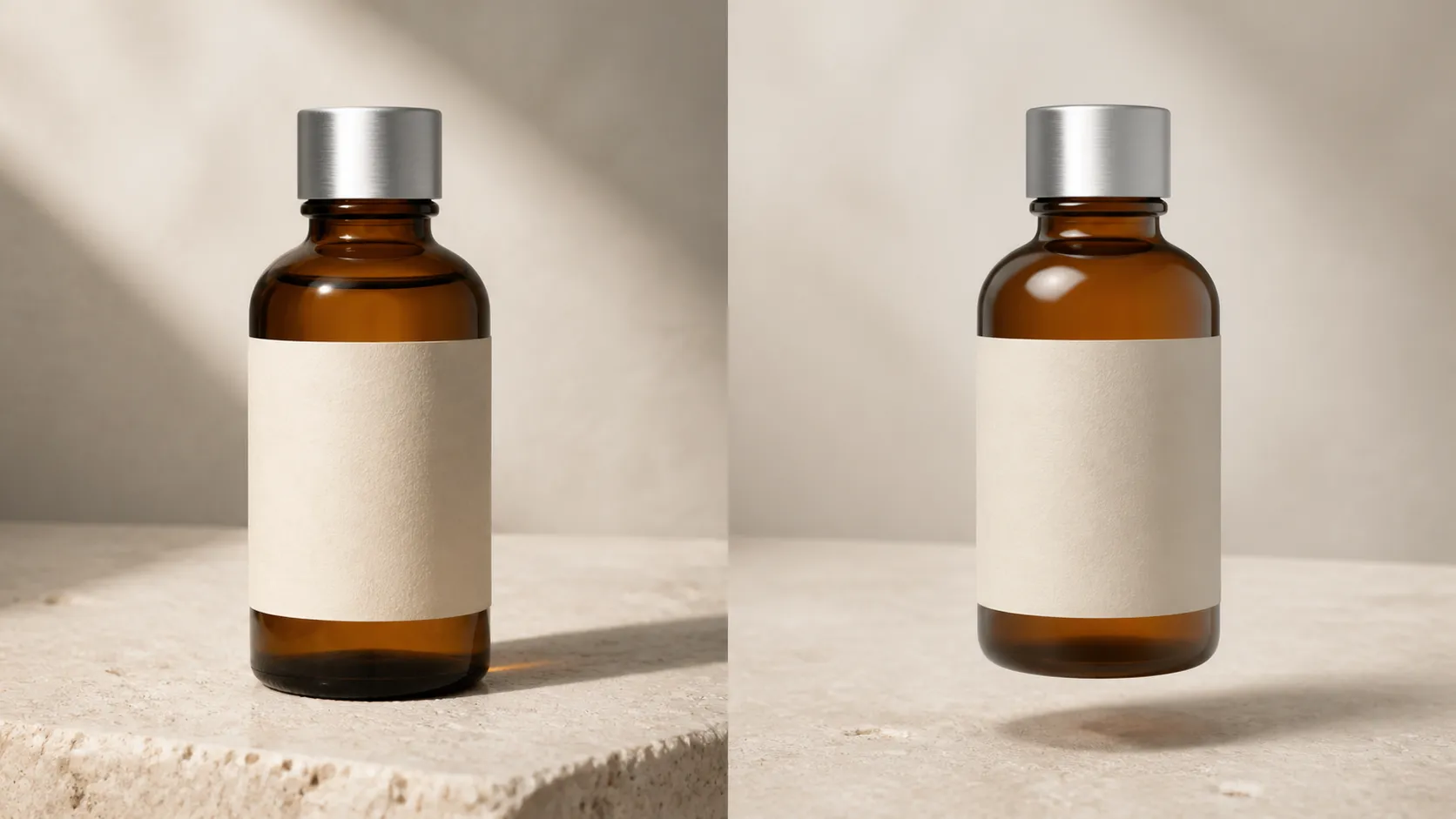
If an AI product photo looks polished but still feels wrong, adding more words like “photorealistic,” “8K,” or “cinematic” probably will not fix it.
The problem is usually not a lack of detail. It is disagreement.
The highlight suggests a window on the left, but the shadow falls in the same direction. The bottle appears to touch the table, but no shadow connects it to the surface. A metal cap reflects a bright room that does not exist anywhere else in the scene. The label is almost correct—but “almost” is not good enough for a product someone is expected to buy.
A realistic product photo does not need to be perfect. It needs to describe one believable physical scene.
The following five-minute check helps you identify what is wrong, decide whether it can be repaired, and avoid wasting another generation on a vague prompt.
Keep the real product beside the generated image
Before judging style, compare the generated image with a real photograph of the product.
Open both images at full size. Do not rely on a small storefront thumbnail, where warped lettering and altered components can disappear.
Check these details first:
- The outer silhouette and proportions
- The number and position of buttons, seams, caps, handles, or fasteners
- Label wording, logo shape, and typography
- Product color and finish
- Patterns, stitching, grain, and small construction details
- Anything a buyer might use to identify the exact model or variant
If these details have changed, the problem is not realism. The image now shows a different product.
This distinction matters because lighting can be repaired locally. A redesigned bottle, invented zipper, or misspelled ingredient label usually cannot. Treat product identity as a pass-or-fail requirement before spending time polishing the scene.
Recent research on product-focused image editing describes the same limitation: current models can struggle to preserve fine-grained branding, textual elements, and product identity during an edit. That is why a real source image should remain the reference, not merely inspiration for a new interpretation. Read the ProductConsistency paper.
Trace the light before looking at the shadow
Find the brightest highlight on the product. It might be a vertical strip on a bottle, a bright rim around a jar, or a soft patch across a cardboard box.
Now ask: what could have produced that highlight?
Look for the implied light source in the rest of the image. A window, softbox, bright sky, lamp, or open doorway should affect the product, surface, props, and background in related ways.
The scene does not need one light. Professional product photos often use a main light, fill, reflector, and background light. But each source should have a job. Random highlights on every side make the product look illuminated from nowhere.
Three quick checks catch most problems:
- Direction: If the strongest light comes from the left, the main cast shadow should generally travel away from it.
- Softness: A large nearby window or softbox creates broad highlights and softer shadow edges. A small, distant source creates harder edges.
- Color: Warm sunlight on the product should not sit naturally inside an otherwise cool, overcast scene unless another visible source explains it.
Traditional product photography follows the same logic. Shopify’s photography guidance recommends controlling window position, other room lights, reflectors, white balance, and camera placement rather than treating brightness as a single setting. See Shopify’s product photography guide.
This is useful prompt information. “Professional studio lighting” is vague. “One large softbox above and to camera-left, with a white reflector on the right” gives the model a scene it can attempt to keep coherent.
Check whether the product actually touches the surface
A product resting on a table normally creates two related shadows.
The contact shadow is the small, darker area directly beneath the points where the object touches the surface. It anchors the object.
The cast shadow extends farther away. Its direction and softness reveal the position and size of the light source.
AI-generated product photos often contain a cast shadow without a convincing contact shadow. The result resembles a cutout hovering a few millimeters above the table. Another common failure is a dark oval placed underneath the product regardless of its shape, light direction, or distance from the surface.
Look closely at the base:
- Does the darkest part of the shadow begin where the product meets the table?
- Does its shape relate to the product?
- Does it become softer and lighter as it moves away?
- Does it agree with the highlight you identified earlier?
- If the surface is reflective, is the reflection aligned with the product?
A bright white catalog image may have an extremely subtle cast shadow. That is fine. The product still needs enough visual contact with the surface to feel grounded.
Read reflections as evidence
Reflections are not decoration. They reveal the world outside the camera frame.
A glossy bottle can reflect a window, a light panel, the photographer’s black flag, or the color of a nearby wall. Metal is even less forgiving because much of its visible appearance comes from what it reflects.
When a product’s reflection suggests a completely different environment from its background, the image feels synthetic even if the viewer cannot explain why.
Inspect reflective areas for:
- Bright shapes with no plausible source
- Repeated windows or light panels at conflicting angles
- Reflections that stop abruptly at product edges
- A tabletop reflection with the wrong perspective
- Perfectly symmetrical highlights in an asymmetrical scene
- Text or logos appearing incorrectly inside a reflection
Glass needs a separate check. Transparent glass should reveal, bend, or soften parts of the background. Its edges are usually more visible than its center. A glass bottle rendered as a uniformly shiny gray object is behaving like polished plastic or metal, not glass.
Do not try to remove every reflection. Real reflective products need them to describe their shape. The goal is controlled evidence, not an empty surface.
Make each material behave like itself
One of the quickest ways to detect an AI product photo is to look at two different materials and discover that they have the same smooth, glossy finish.
Material realism depends on how a surface responds to light:
| Material | What to look for | Common AI failure |
|---|---|---|
| Glass | Transmission, refraction, bright edges, visible internal structure | Opaque or uniformly gray |
| Brushed metal | Environmental reflections with fine directional grain | Flat silver gradient |
| Polished metal | Strong, sharp reflections that describe the surroundings | Random white streaks |
| Fabric | Weave, fibers, folds, and small self-shadows | Painted-on texture |
| Matte plastic | Broad, restrained highlights and slight surface texture | Mirror-like shine |
| Glossy plastic | Clear highlights with less complex reflection than metal | Wet or glass-like appearance |
| Paper or cardboard | Fine fiber texture, soft edge wear, subtle tonal variation | Perfectly smooth 3D render |
Use precise material language when regenerating. “A premium bottle” tells the model almost nothing about the surface. “An amber glass bottle with a matte paper label and a brushed aluminum cap” separates three materials that must react differently to the same light.
Avoid adding fake damage simply to make an image feel real. Dust, scratches, fingerprints, and roughness can help in the right context, but they can also make a new product look used. Correct material response is more important than decorative imperfection.
Check scale, perspective, and depth of field
Some images pass every close-up texture check and still feel like a miniature.
Start with the supporting objects. A coffee cup, hand, tile, leaf, or piece of fruit gives the viewer a scale reference. If those objects are too large or too small, the product inherits the wrong apparent size.
Then inspect the camera logic:
- Do the vertical and horizontal lines share believable vanishing points?
- Does the bottom of the product follow the angle of the surface?
- Is the camera looking down at the product while the tabletop appears eye-level?
- Does the amount of background blur make sense for the product’s size and distance?
- Are the front and back edges of a small product inexplicably separated by extreme blur?
Depth of field is not a realism filter. Too much blur can make an ordinary product look like a miniature, while an entirely sharp lifestyle scene can feel like a composite.
Also inspect the product edge against the background. Bright halos, dark cutout borders, melted corners, or background color leaking into the label are signs that the product and scene have not been integrated cleanly.
Use a structured repair prompt
When the product itself is still accurate, repair one variable at a time.
A useful prompt does not need to be long. It needs to assign clear physical roles:
Keep the uploaded product’s shape, label, colors, proportions, and cap unchanged.

Place it upright on a pale limestone surface in a quiet bathroom setting.

Use one large diffused window light from camera-left and a white reflector on the right.
Add a short, soft contact shadow directly beneath the bottle and a lighter cast shadow extending right.

Render the amber glass as transparent at the edges, the label as matte paper,
and the cap as brushed aluminum with fine vertical grain.

Use a natural eye-level product perspective with restrained background blur.
Do not add new text, logos, decorative parts, or packaging.
Change only the section connected to the failure. If the shadow is wrong, do not simultaneously replace the background, camera angle, props, and material description. Otherwise, you will not know which instruction helped—and the model has more opportunities to alter the product.
When a completely new scene is the right fix, use the real product image as an input rather than rebuilding the item from text alone. You can build a new product scene from an uploaded reference, but the result should still be checked against the source. A reference image gives the model more evidence; it is not a guarantee of exact product fidelity.
Decide when to edit, regenerate, or use the real photo
Not every problem needs another full generation.
| What failed | Best next action |
|---|---|
| One small shadow, edge, or color mismatch | Make a local edit |
| Lighting is plausible but too flat | Adjust lighting while preserving the scene |
| Product shape, label, or construction changed | Regenerate from a better reference |
| Several physical relationships conflict | Rebuild the scene instead of patching it |
| Complex transparent packaging keeps changing | Composite the real product into the generated scene |
| Exact product truth cannot be maintained | Use the real photograph |
The last option is not a failure.
For a primary listing image, technical diagram, regulated label, or detail customers depend on when buying, a real photograph may be the honest and efficient choice. AI is often more useful for lifestyle scenes, campaign concepts, background variations, and social crops where the product can remain anchored to verified source material.
Why human review will remain part of the workflow
Image models are improving quickly, but visual polish and physical correctness are not the same benchmark.
A 2026 study comparing image-editing models against real captured lighting changes found that the strongest models could be remarkably consistent with real-world physics, while still leaving meaningful room for improvement—particularly in regions receiving less light. The researchers also found that general vision-language models were not suitable for judging pixel-level light transport in their test. Read the lighting benchmark.
The practical implication is not that AI product photography cannot look real. It is that quality control cannot be reduced to asking another model, “Does this look good?”
A person who knows the real product still needs to check the label. Someone still needs to trace the light, inspect the contact shadow, and decide whether the material behaves correctly.
Before publishing, ask:
- Is this still the exact product?
- Can I explain where the light comes from?
- Does the product make convincing contact with the surface?
- Do reflections belong to this environment?
- Does each material react differently and correctly?
- Are scale, perspective, and depth of field believable?
- Would this image give a buyer an accurate expectation?
If the image survives those questions, it does not need another layer of “photorealistic” polish. If it does not, more polish will only make the mistake harder to notice.
Try it
Run your own prompt in the generator
Pick a model, run one prompt, and compare the results side by side. New accounts start with free credits.

How to Remove Tourists From Photos Without Photoshop
Remove tourists, crowds, strangers, and photobombers from vacation photos with AI—no Photoshop or manual masking required.

No Limit AI Image Generator Guide
Learn what a no limit AI image generator really means, which limits still matter, and how to create more images efficiently.