How to Change Product Colors in Photos
Change product colors from one photo. Follow a practical workflow with real tool outputs, then check fabric, labels, edges and color accuracy.

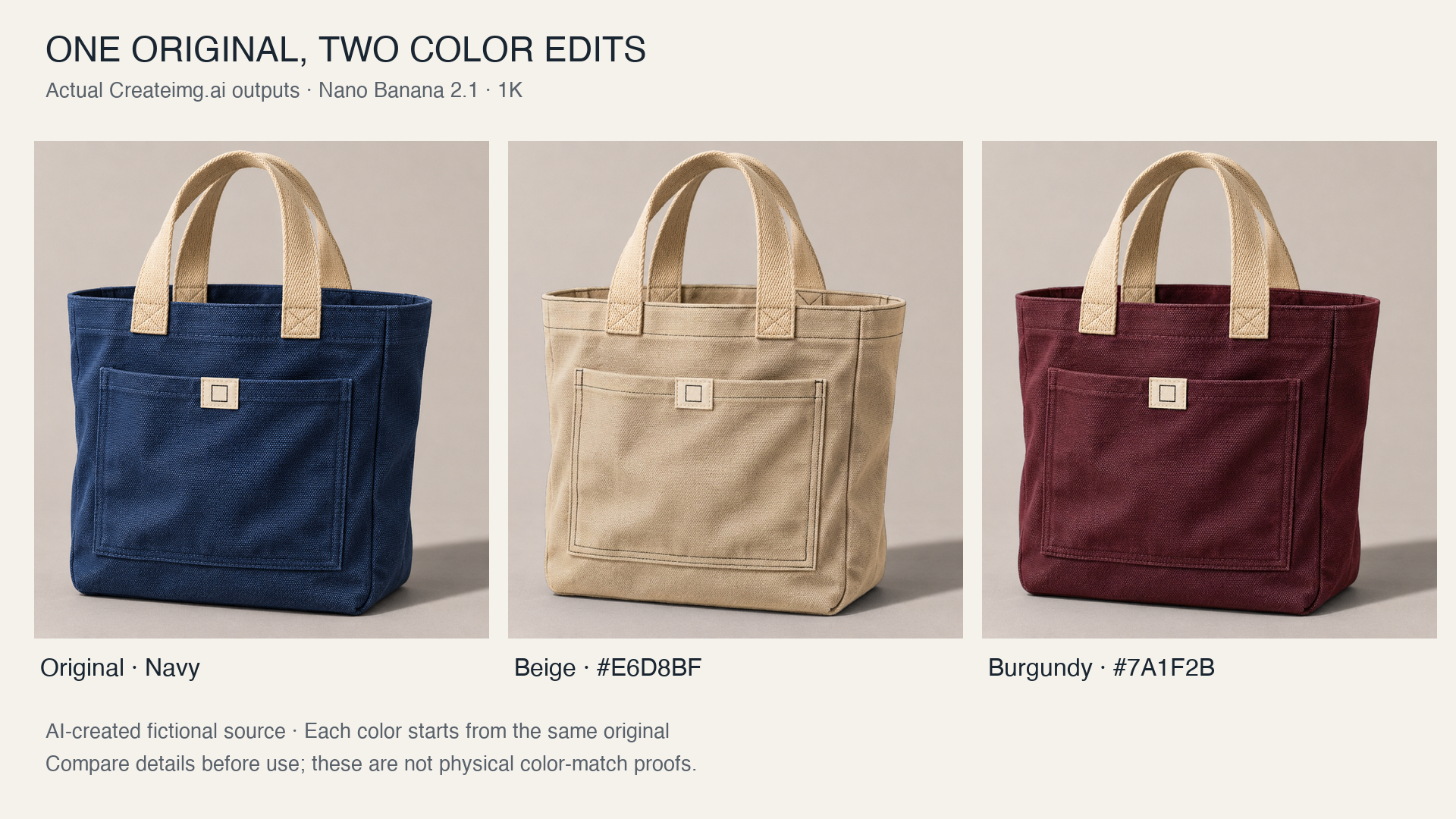
Changing a product's color is useful only if it still looks like the same product. The outline, fabric, label, handles, shadows, and camera angle all matter when someone compares different versions.
This tutorial shows how to use Createimg.ai's AI Color Changer to make separate color versions from one original, then inspect the details before using them.
About the example: our source is a fictional blue canvas tote bag created with AI, not a photograph of a physical product. We used the live tool to make beige and burgundy versions from that source. These examples demonstrate the editing workflow; they do not establish a match to a manufactured bag or real fabric swatch.
Actual tool outputs, tested November 4, 2026. All three panels use the same crop and display scale; the source and outputs were not retouched. Both edited files retain the original 1536 × 1024 dimensions.
Start with a photo you can inspect
Choose a clear image in which the product is large enough to see its edges, seams, and identifying details. Soft, even lighting makes it easier to judge whether a new color belongs in the scene. A colored light or a heavy filter can make the original surface harder to interpret.
Keep the original file untouched. You will use it both as the starting point for every color and as the reference for checking the results.
For a first attempt, choose a mostly solid, matte surface. Fabric, painted wood, and plastic are more straightforward candidates than transparent glass or mirror-like chrome. Changing blue canvas to beige is a different task from turning canvas into leather or changing a matte finish to glossy.
Our example is a 1536 × 1024 image with a blue body and front pocket, two light handles, and a small cream label. Those contrasting parts give us specific details to check.
Decide which parts should change
Before selecting anything, make two short lists. For the tote bag, ours were:
| Change color | Keep as they are |
|---|---|
| Main canvas body and blue front pocket | Light handles, cream label, bag shape, background, and shadows |
The distinction matters because a product can contain several detected parts. Selecting the main object does not necessarily mean every attached component is included.
After upload, the tool detected 12 regions in our image. The main object was listed as “navy blue tote bag,” with additional suggestions including the handles, front pocket, and logo. We added the front pocket, giving us two selected regions. We left the light handles and the cream label, listed as the logo, unselected.
Use your own product's construction as the guide. A cuff, lid, strap, or trim piece may need to change with the body, or it may be intentionally different. Check the highlighted area before spending credits on a recolor.
Make the first color version
Open the color changer, upload your original, and wait for the detected objects. Click the parts you want to recolor, then choose a preset or enter a HEX code.
For our first submission, we used:
| Setting | Value |
|---|---|
| Selected parts | Tote body and front pocket |
| Target color | Beige, #E6D8BF |
| Model | Nano Banana 2.1 |
| Resolution setting | 1K |
| Test date | November 4, 2026 |
The page showed a list price of 40 credits for this setting; our account was charged 36 credits for the submitted job. Your price can differ, so check the amount beside Recolor before submitting. These are the settings and price for this test, not a comparison of the available models.
When the result is ready, save it separately from the source. Use a filename that identifies the intended color, such as tote-beige-E6D8BF, and retain the original download for close inspection.
The beige result changed both the body and front pocket. The woven surface remained visible, and the light handles and square label mark were still recognizable. The pocket's dark stitching stood out more strongly against the light canvas, so it needed a closer check rather than an automatic pass.
Allow for a wait. Our beige job was still processing nearly two minutes after submission, longer than the page's usual 20–60-second estimate. Check the existing job before submitting again; another recolor is another charged attempt.
Create the next version from the same original
Start each additional color from the unchanged source image. If the original and selection are still available, check them before submitting again; otherwise upload the original file again.
Avoid using the beige output as the input for a burgundy version. Returning to the source keeps the starting composition consistent and makes each result easier to compare. It also avoids carrying an unwanted alteration from one edit into the next.
This is a workflow for separate, single-color edits. It does not imply that the tool generates a batch of colorways in one request.
We clicked Try another color, confirmed that the original blue image and the same two selected regions remained in place, then chose Burgundy, #7A1F2B. We kept Nano Banana 2.1 and 1K. This second job also cost our account 36 credits, bringing the two-run total to 72.
The burgundy version changed the body and pocket while keeping the pale handles and label visually distinct. It also retained the original image dimensions. We made no additional correction runs.
Compare the details before using a result
Place the original and each edited version beside one another at the same displayed size. First check the whole product, then zoom in on details that could affect its identity.
Equal-coordinate crops from the original PNGs. The weave and square mark remain visible; the beige pocket seam has a stronger dark contrast.
| Check | What to look for |
|---|---|
| Shape and position | The opening, corners, pocket, and handles should keep their proportions and positions. |
| Fabric and seams | Look for softened weave, missing stitches, or a surface that appears smoother than the original. |
| Label or print | Compare the outline and internal marks, not just whether a light patch remains in place. |
| Separate components | Check that parts meant to stay light have not picked up the new color. |
| Edges and background | Inspect the boundary around handles, gaps, and corners for old-color fringes or spill. |
| Light and shadow | Highlights and shaded areas should still describe the same folds and lighting. |
Judge each color separately. One convincing version does not prove that a much lighter or darker target will work equally well.
At full size, both versions kept a recognizable bag silhouette, pocket, handles, and label. The beige version made the dark pocket seams more prominent, and some fold shading differed. The lighter base color also changes perceived contrast; that observation alone does not tell us how much detail was redrawn.
We also compared small label and handle patches in the original PNG files. Both edited versions had some changed pixels in those patches, even though the parts looked similar. These rectangular samples can include boundaries and background, so differences do not by themselves identify changes inside an unselected part. Two sampled outer-background strips were identical. Those limited checks do not establish that every unselected pixel is unchanged. For a product listing, inspect important marks and trim yourself instead of assuming that leaving a part unselected guarantees an exact copy.
For a broader product-image checklist, see how to make AI product photos look real.
Fix a missed part before changing the whole approach
If a pocket or strap keeps its original color, return to the selection and check whether that part was included. Add the relevant detected component, then recolor from the original. Leave deliberately contrasting parts unselected.
If the needed detail was not detected, try an image where it is larger, sharper, and less obstructed. The current tool does not provide a brush for drawing an arbitrary selection. A manual editor may be more suitable when you need precise control over a tiny detail.
If the shape, label, or material changes, do not treat the version as finished just because the overall color looks appealing. Revisit the input or selection, use a manual editing method, or photograph the actual product instead.
Check the color against the real item
A HEX code gives the editor a target screen color. It does not mean every pixel should have that value: highlights, shadows, and texture create lighter and darker areas across a surface.
It also does not prove a physical color match. Our fictional tote has no manufactured sample to compare against, so these edits can demonstrate a visual concept but cannot verify a real beige or burgundy fabric.
For an actual listing, compare the image with the real variant under suitable lighting. Confirm that the pictured color, material, and details describe an item you can supply. Keep the original and reviewed color versions organized, and use the edited image only after those checks are complete.
Try it
Run your own prompt in the generator
Pick a model, run one prompt, and compare the results side by side. New accounts start with free credits.
How to Turn an Image into a Prompt: 3 Editable Examples
Turn a reference image into an editable AI prompt with three examples. Learn how to change lighting, setting, or subject and fix unclear descriptions.
6 Funny AI Image Prompts to Copy and Customize
Copy six funny AI image prompts for pets, work, and everyday objects. Customize each idea and use simple edits to make the visual joke clearer.